resource design

Top 5 for public domain images
While the Internet is possibly the best thing that’s happened to teaching and education in the last thirty years (think TES resources, Twitter, independent sites, quick communication channels), it also comes with a minefield of copyright issues. A couple of weeks before I left my last job, an email went round to all staff reminding them of copyright issues with downloading and using images from the Internet – and I used to be as guilty of this as the next person. When planning a lesson, it’s very easy to just Google and pull in an image from anywhere to jazz up a PowerPoint – accessing images from all over the world means that you can easily illustrate a point about real-life applications of the mathematics pupils are studying. However, with the prevalence of online resource sharing, it’s more important than ever to make sure that images used and redistributed are actually done so legally.
I don’t profess to be an expert on copyright – when reading and researching around the subject while picking content and images for blogs, it’s clear that even experts are struggling to keep pace with the changes in technology. One case in point isย Pinterest, popular not only with educators but with hobbyists globally. By traditional copyright law, Pinterest users should either own or have permission to distribute the content they are posting, creating a real dilemma with Pinterest’s stated aim of being a “visual bookmarking tool”. There’s an interesting article from theย Wall Street Journal hereย if you’re interested in finding out more about the legal issues.

โ€‹Fortunately, there are plenty of quality public-domain image sites where you can source content available for any use, often including full commercial rights – so without further ado, here’s my top 5.


1. Wikimedia Creative Commons

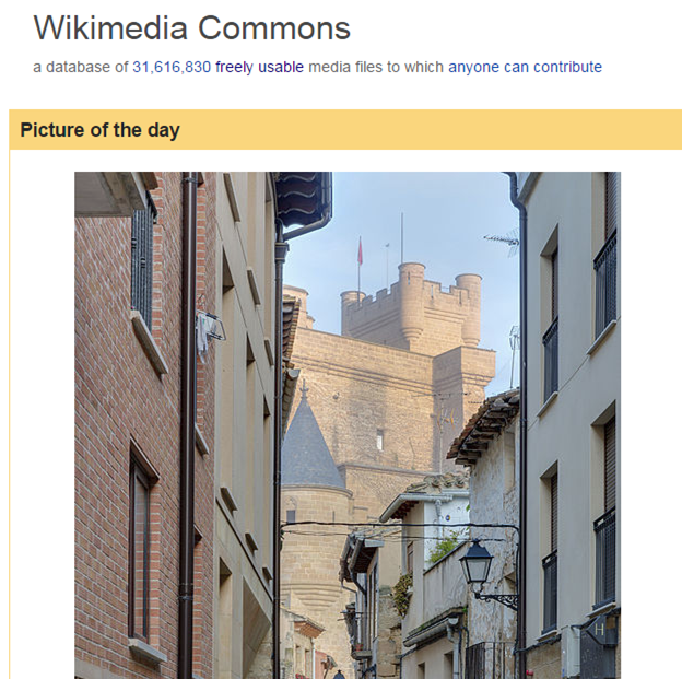
Theย Wikimedia Creative Commonsย library is a huge library of user-created content – many of the pictures and resources have been uploaded by amateur photographers or creators, and you can easily search pictures for most topics.

I source 90% of my blog header images from here. Pictures often require attribution, but most creators are happy for their work to be used in any electronic or print format. It’s worth checking out – there are some very high quality images on there.

2. Pixabay

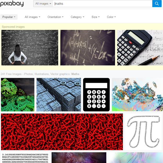
Pixabayย operates in a similar vein to the Creative Commons library, and contains thousands of copyright-free images. The pictures on here are incredibly good quality, and while finding very subject-specific images is difficult, they have a broad range of general mathematics images, along with plenty of real-world pictures to illustrate teaching points.

One word of warning – there are some images hosted from Shutterstock (clearly watermarked) which are not public domain and require a license.

3. Clker

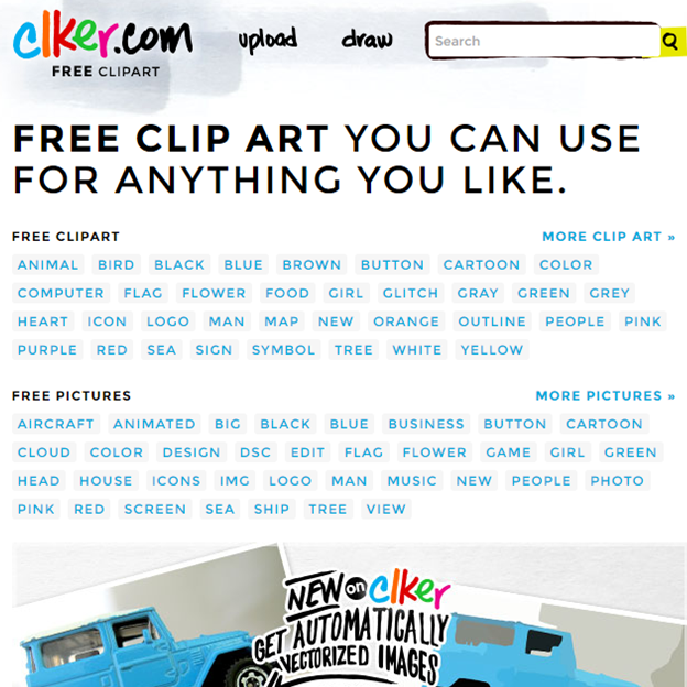
Clker’s online clipart galleryย is created by users and uploaded under the CC 1.0 Universal license, which essentially waives any copyright on the content.

โ€‹They have a wide selection of images, including plenty for educators. The quality can be a little hit-and-miss, but there are some really nice pieces of clipart on there if you dig deep.

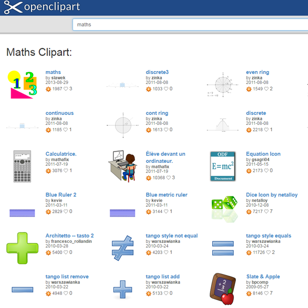
4. Openclipart

Openclipartย operates in a similar vein to Clker, and provides user-created clipart images under an unlimited license.ย 

Many creators on Openclipart produce series of clips in the same style, which can be useful if you’re looking for a set of matching images to add to a resource or presentation.

5. DIY

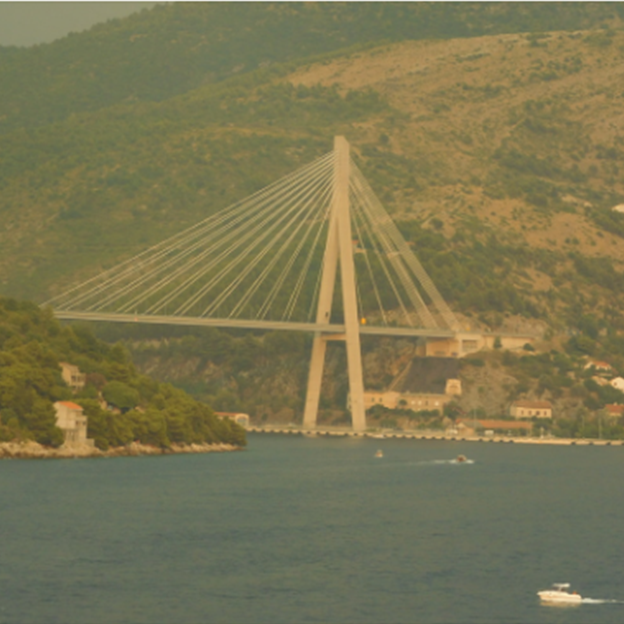
This may seem facetious, but one of the best sources of realistic mathematical images is getting out there and taking photographs yourself. Most of us now carry around a very high quality digital camera on our smartphones, and there are plenty of opportunities for capturing some excellent real-world mathematics.

โ€‹I attempted aย Maths in Picturesย series on my honeymoon last year as part of theย summer blog challenge, and Tom Bennison recently postedย Posing Mathematical Questionsย featuring four excellent mathematical images. Look out for floor tiling patterns and interesting structures, and if you’re after a specific image, it may often be quicker to create it yourself than try to hunt down what you’re after online.

Honourable mention: Canva

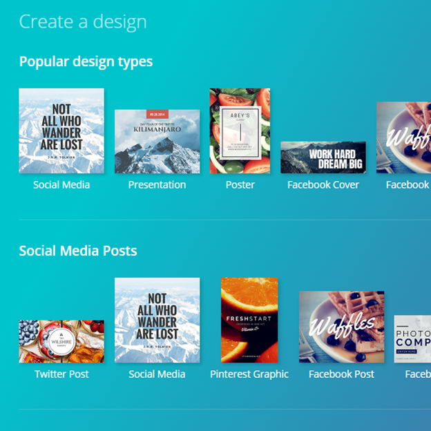
Whileย Canvaย is not exactly an image library, I thought it’s worth including on this list because it is quite simply the best free source for creating high-quality composite images for things like blog headers or social media posts. I discovered Canva viaย Mark Anderson’s post on Staffrmย while doing theย 29 days of writing challengeย in February.

It’s very easy to learn to use, with options to use their free images or upload your own. I particularly like the automatic sizing options for various social media formats, such as Facebook covers or Twitter cards. I created the header image for this post in about three minutes!
Top 5 for public domain images Read More ยป

Design matters (a #mathsconf5 blog)

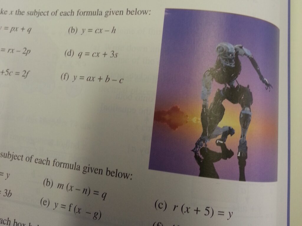
This picture completely mystified my Year 10 class this week…

To put things into context, we were working on a standard set of simple rearrangement (for them) of formulae, with absolutely no real-life context (contrived or otherwise) mentioned in the questions. The textbook authors appeared to have just plonked an image of a scary-looking skeleton (reminds me a little bit of something from Terminator?) right in the middle of the exercise.

I’ve been thinking quite a bit about the design of resources since attendingย Amir Arezoo’sย workshop atย #mathsconf5, and I did promise a more in-depth post at some point, so I figured that Terminator/Skeleton was as good an excuse as any.ย The workshop was titled ‘Design Cues for Great Resources’ – I do love excellent quality teaching resources, and making teaching materials is one of my big passions, so signing up seemed like a no-brainer.ย 

(I apologise in advance for the atrocious quality of the images in this post – by Workshop 3, my phone had properly died, so I was taking these using my tablet, which isn’t the greatest…)

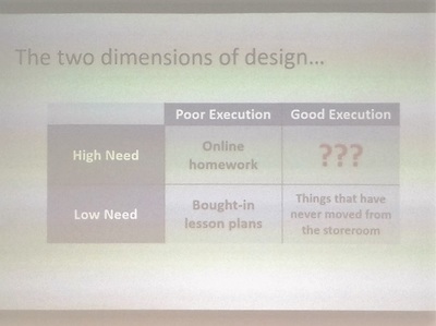
Dimensions of Design

This look at the dimensions of design (everyday on the left, teaching-specific on the right) was really interesting. The High Need/Poor Execution box contains all the necessary evils – we all know how many issues there can be with online homework, but it does make marking significantly more manageable and usually offers at least some independent support for pupils if they get stuck. I’ve moved away from using quite so much bought-in online homework this year, as I decided it was more trouble than it was worth – but that’s fuel for another blog post.

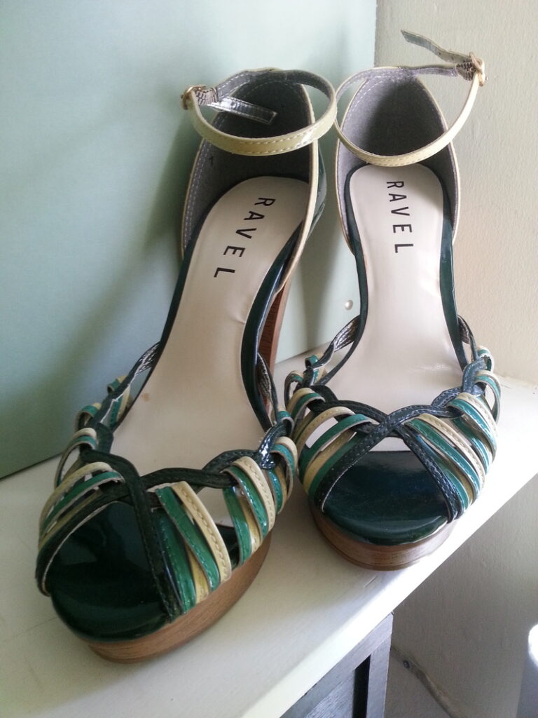
Something that I felt had implications for me, both as a teacher and a sharer of resources was the classification of bought-in lesson plans in that Poor/Low box. The parallel with high heels is so perfect thatย I had to break off typing this to go and take a picture of this pair of shoes.

I saw these in TKMaxx about four years ago. I tried them on – they were a little high, but I thought I could cope. At a price of less than ยฃ10, I decided they were too beautiful to leave in the shop.

They have sat in that position on a shelf in my house since about a week after I bought them – I’m lucky that they’re green, and complement my lounge so well, otherwise they’d have gone in a box in my wardrobe long ago. I physically cannot wear them for longer than about five minutes, not because they make my feet hurt, but because they are so high that I end up walking like a baby giraffe, completely contrary to the chic, sophisticated look I was after.

My computer is similarly filled with the teaching equivalent of these shoes – resource packages which seem amazing, but when you actually try to use them, they’re completely unfit for purpose in your specific setting with your specific pupils. 

โ€‹Every year I try to save complete lessons or even topics on my computer, thinking that I can just use that lesson as it is next year, but inevitably end up pulling it apart, reshuffling, adding in or taking away as appropriate. This year I’ve started saving tasks rather than lessons, which has made planning much, much easier, and any of my new uploads on here will be organised in a similar way.

Visual Design

The picture I took for this bit isn’t even worth putting up, as you can’t read it, but I was pleased to know that I’m not the only one who’s slightly OCD about how my resources look. All the way through university, my friends used to laugh at me because I had to write up my lecture notes in neat at the end of every lecture, using a particular pen and outlining definitions and lemmas in a particular pen. Maybe it’s just me, but I really can’t revise from messy notes, and I similarly can’t teach from badly-formatted resources.

The key features that Amir highlighted were:

  • Colour
  • Typeface
  • Use of spacing/formatting
  • Imagery

Badly spaced or formatted question sets really annoy me – consistently modelling the correct way to write a fraction seems a little pointless when a resource insists on writing it as 1/3 rather than placing the numerator above the denominator (yes, I’m annoyed now that I can’t do it properly on here either!). 

I use questions on the whiteboard far more frequently than I use textbooks, because it’s much easier to set exactly the work that you want to – I think it’s incredibly important to space questions so that pupils aren’t confronted by an intimidating wall of words or symbols. Twenty questions looks far more approachable in two neatly-spaced columns of ten than in one squashed list of twenty.

Typeface is another big one for me; although I genuinely do not understand the hate for Comic Sans in teaching resources, I know that a lot of people really don’t like it, so I’m designing a lot of my newer (shared) resources in a less contentious font. I did agree with Amir’s point about consistency of font use – too many different fonts on a resource, and it starts to look confusing and cluttered.

The thorny issue of images brings us back to the picture at the start of this post – I’m a firm believer that images, unless directly relevant to the topic you’re teaching, or adding something to the instruction, need to stay firmlyย offย teaching resources. In my experience, rather than engage pupils, they actually create more distraction as pupils either a) end up thinking about or processing features of the image, rather than the mathematics or b) get completely distracted and start talking / thinking about wider contexts. I used a resource once that had a Simpsons character on the plenary slide… never again. The resource was superb, but about half the class got distracted by Bart at the chalkboard, and I then had to pull them back to the task again.

Instructional Design

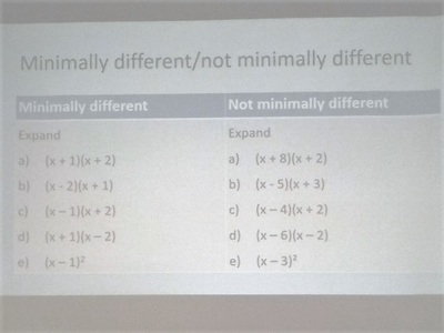
Both of these ideas are things I’d like to investigate further – I’ve seen the idea of minimally different questions mentioned in a few blogs, but finding pre-made resources is difficult, and creating a set of problems like this requires significantly more time and effort than “making some questions up” or using a question generator. The left-hand list for expanding quadratics would certainly remove some of the cognitive load for pupils still struggling with quick recall of multiplication tables, while simultaneously getting them to think very carefully about the impact of directed numbers and symbols.

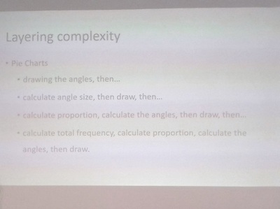
I really want to try this approach to teaching pie charts, and also start to look for other areas where complexity can be layered gradually, rather than giving a long method for pupils to try to follow all at once. I think this is done naturally to some extent with topics such as solving equations (begin with one-step, then move to two-step, then unknowns both sides), but I’m going to keep my eyes open for other content areas I can try this.

Use and economy of language is an important consideration (particularly pertinent when choosing exam boards); I’m guilty of setting problems that contain a lot of useless or irrelevant information, because I think I’m getting the pupils to practise their problem-solving skills. Realistically, I know from experimenting with Year 7 last week on ‘wordy’ problems that they’re usually very capable of working out what’s irrelevant and removing that, and are actually getting hung-up on the mathematics involved. Couple this with the fact that all the pupils who struggle with literacy are having to work significantly harder, and I think I’m going to be using a lot more context problems like the set on the right from now on, particularly when my focus is on them developing their mathematical and problem-solving skills.

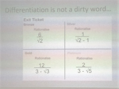
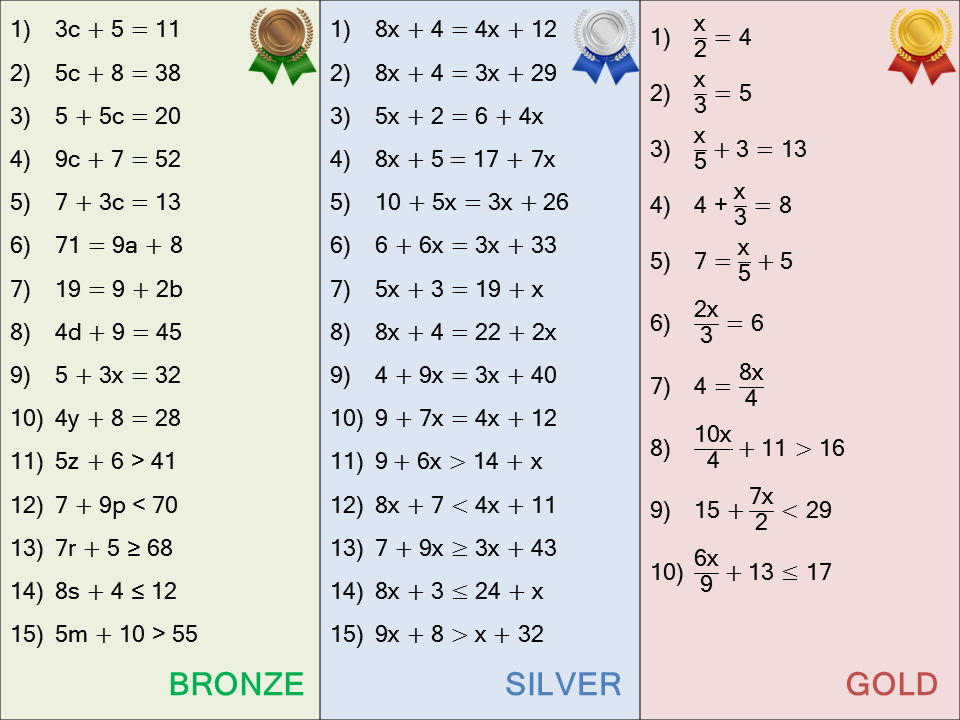
Finally, the idea of using bronze, silver and gold to differentiate rather than red, amber, green has already made its way into my teaching. Our move to some mixed ability this year means an increased amount of differentiation, with some pupils consistently working on what I used to call the “red” activity. It’s not made a perceptible difference in the classroom, but I certainly feel much better talking about “the bronze questions” rather than “the red questions”. Here’s one I used for linear equations and inequalities this week:

Design matters (a #mathsconf5 blog) Read More ยป