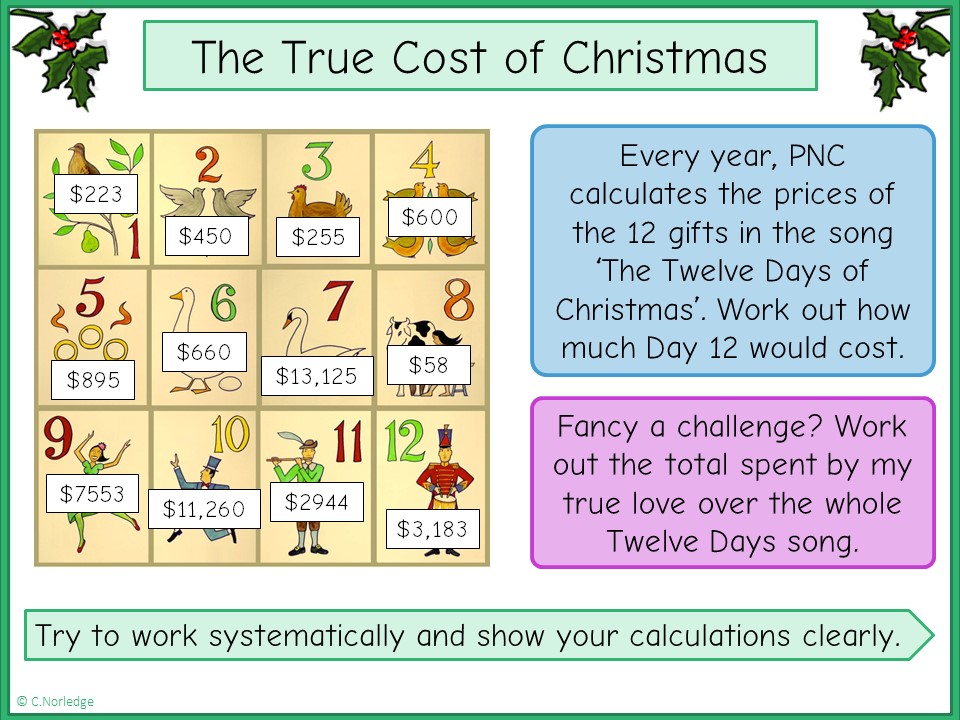
Each year, the PNC calculates and publishes the market prices for each of the presents featured in the Twelve Days of Christmas. Their website, which is definitely well worth a look, says:
It all started 38 years ago as a way to engage clients of PNC’s predecessor, Provident National Bank in Philadelphia, during the traditionally light holiday weeks. What hatched as the creative brainchild of the bank’s then-chief economist has since grown into one of PNC’s most popular and anticipated economic reports.
PNC Christmas Price Index
There are also some fantastic graphs to explore, showing fluctuations and rise in the cost of different items over time. For example, lots of the birds in the first few days were consistently priced until the early 90s, where prices jumped considerably. The maids a-milking reflects the plateaus of minimum wage in the US, whereas the ladies dancing and lords a-leaping, both from the Philadelphia Ballet, show a more gradual rise in wages with inflation.
Image credit: https://commons.wikimedia.org/wiki/File:XRF_12days.jpg
Shared under Creative Commons Attribution-Share Alike 3.0 Unported license

