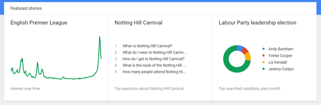
A quick post tonight to share Google Trends, an interesting little web app from Google that allows you to explore what people have been searching for online. I discovered this site a few years ago, and it’s great for getting some interesting real-life data and graphs for short discussions in the classroom.First of all, there’s a selection of featured stories on the front page – the app defaults to the US but you can select other countries instead. Each of these links to a fuller report which typically includes graphs exploring different elements – for example, the Notting Hill Carnival report shows a nice graph over time of interest in the carnival.
You can pull up a report for any search term or topic; typically you get an interest over time graph, a regional interest map and related searches.
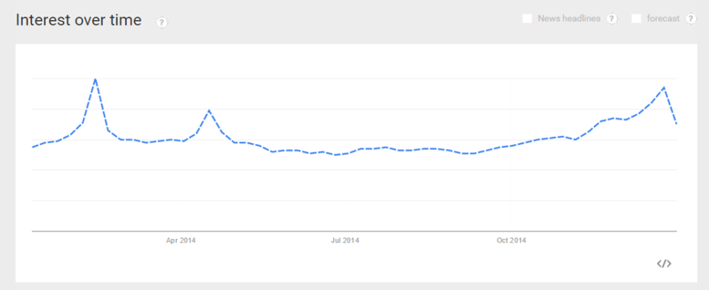
A nice little activity using this is to display a graph of a particular search term, but not tell pupils what that term is. They then need to work out (or try to guess) what the search term is – I’ll let you try and work out this one.
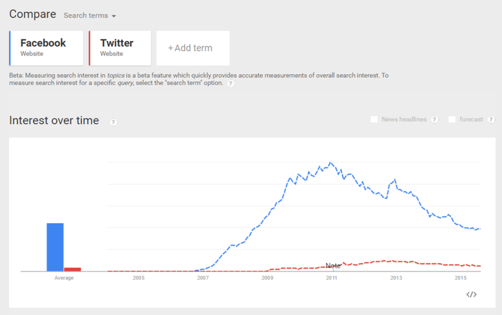
You can also create comparison reports and graphs, and reports go back to 2004. Here’s a comparison for searches for “Facebook” and “Twitter”.
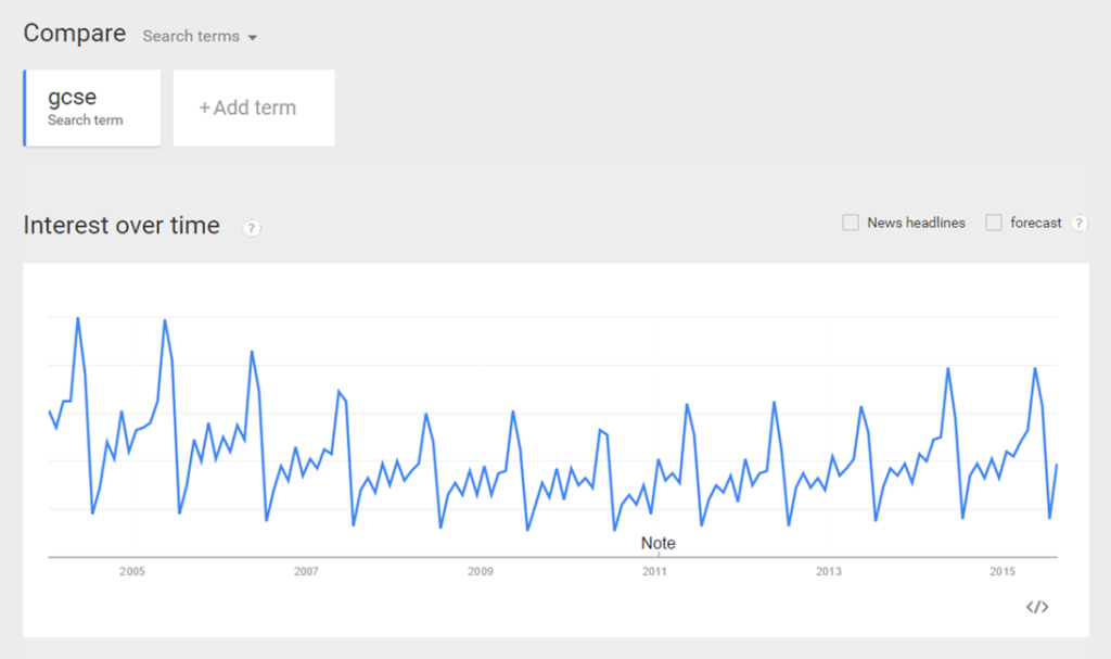
It’s also quite interesting just to have a play and see what patterns you can find. Here’s the interest over time graph for “gcse”: