This was one of the first lessons I wrote in the first year of my teaching career, and is still one of my favourite ways to introduce pie charts. There’s also loads of scope for adding extra stuff in, such as work on fractions and percentages if appropriate for the group.
Pupils begin by thinking of the activities that make up their average day, and use a 24-sector pie chart template to colour-code this. They then look at the fractions of their day spent on various activities. Using a life expectancy of 80 years, they then calculate how many years they spend in total over one lifetime on each activity. To finish off, I’ve recently added this video to the end of the lesson, which looks at representing the average life as a pile of jelly beans.
The lesson(s) detailed below have been absolutely groundbreaking for me in terms of teaching adding and subtracting fractions in a way that makes the topic stick and that pupils really understand. The ideas behind it were introduced to me as part of the NCETM’s Multiplicative Reasoning course (previously mentioned in my blog about bar modelling). Unfortunately, while I have the lesson materials, I’m still unsure about their status in terms of sharing – they were presented to us as trial materials, with the suggestion that they would be available to schools nationwide once the project had finished, but I can’t find them anywhere on the NCETM’s website (yet). So although I can’t post a link to the PowerPoint and lesson materials I’m using, I thought I’d pop up a quick blog about the ideas behind the materials.The lesson was titled “Our survey said…” and formed part of a sequence of lessons about fractions. The previous lesson was along the lines of this one on sharing cakes, and got pupils to explore using rectangular models to represent fractions. This lesson continues the themes explored there, although it doesn’t look like it from the outset!
Lesson 1 – Developing understanding using pie charts
The lesson begins with an explanation about a school canteen worker who wants to ensure that she is buying the right amounts of different types of fruit and vegetables to cater for the pupils in her school, so she surveys them about their favourite types of fruit and veg. After a few minutes of discussion around this, I then explain to pupils that we are going to do the same thing, and find out what our results look like. I did this last week with Year 7, so I’ll use their results for illustration purposes.
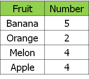
First of all, I got them to vote for their favourite fruit. It’s worth “fiddling” the results a little bit here to give a useful denominator – I added myself into the survey so that we were working with fifteenths rather than fourteenths, as I wanted to get away from the idea that simplifying fractions only involves continual halving. Here are our results:
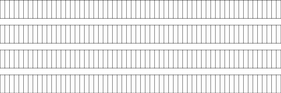
I provided pupils with these premade bar diagrams (on card) and asked them to produce a bar model of our results. For reference, there are 60 segments per bar – most flexible in terms of further work.After a couple of minutes of colouring in, pupils had produced something like this:
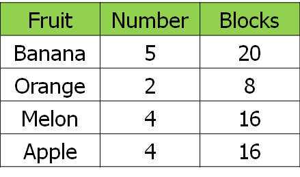
Together we worked out how many segments we would need to shade in for each type of fruit:
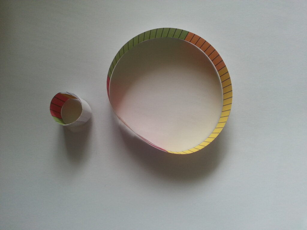
Creating a pie chart with small and big bars.
The original lesson then gets pupils to cut out their bar, turn it into a circle with a paperclip and use this to create a pie chart. There’s then a lot of scope for discussion in terms of links between the two models, such as the fact that it’s clearer to see that (in this case) 1/3 of the class preferred bananas. Now, normally I get pupils to do this with their small bar first, before moving on to the next stage. However, the relatively small size of my class gave me a bit of inspiration – I demonstrated with my small bar what I was going to get them to do, and hammed up the fiddling around a little bit – “Oh, it’s going to be so difficult to do this with this tiny bar… how can we make it easier?”. It didn’t take long for one bright spark to suggest that we used a larger bar with more segments for each pupil.
And then they produced this, using four segments for each pupil:
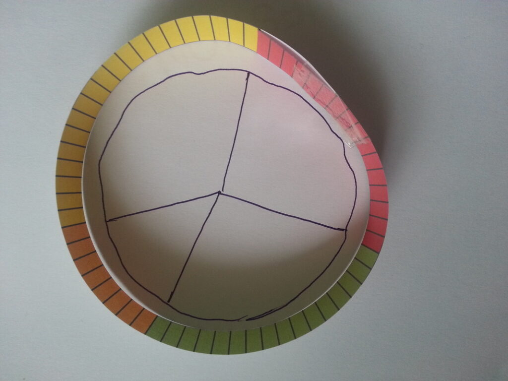
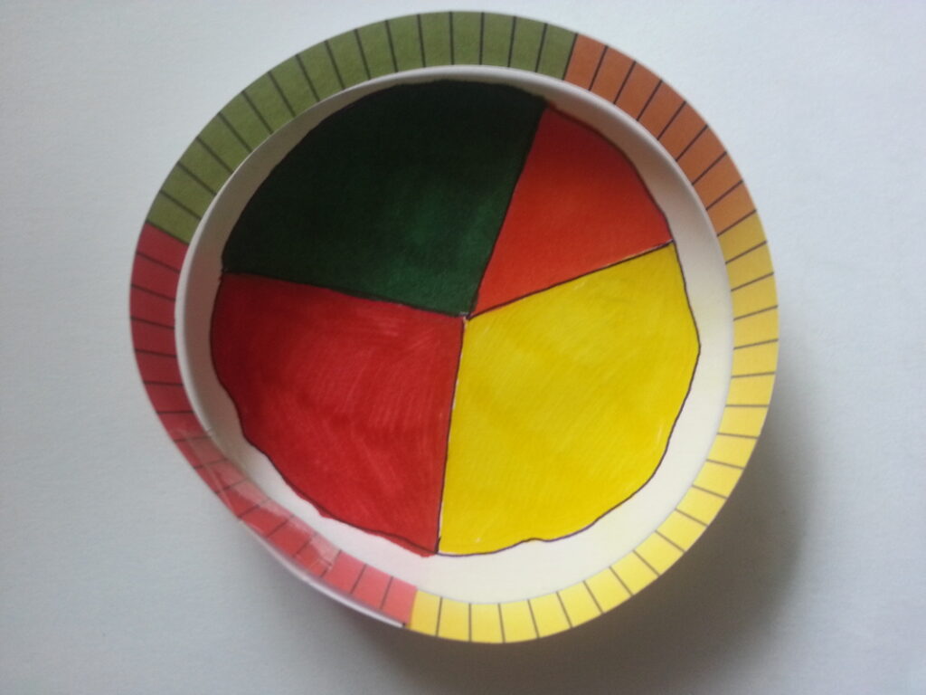
I then got them to turn their bar into a pie chart (little tip, when cutting out, leave a little bit of card on the end of the bar to make it easier to fix the two ends together). Check out the pics below to see the process.
Draw a circle using the inside of the bar. Mark the intersections, then join to the centre point.Colour code the pie chart using the same colours as the bar.
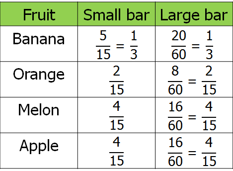
After discussing what their pie charts showed, we then got into the fractions stuff. We came up with fractions for our small and big bars, then looked at the equivalence of these fractions.
To finish the lesson off, we linked the work we’d done this lesson with fraction of amounts calculations by scaling our results up for a group of 300 pupils and working out how many of each fruit should be bought for a group this size.
We use cookies to optimize our website and our service.
Functional
Always active
The technical storage or access is strictly necessary for the legitimate purpose of enabling the use of a specific service explicitly requested by the subscriber or user, or for the sole purpose of carrying out the transmission of a communication over an electronic communications network.
Preferences
The technical storage or access is necessary for the legitimate purpose of storing preferences that are not requested by the subscriber or user.
Statistics
The technical storage or access that is used exclusively for statistical purposes.The technical storage or access that is used exclusively for anonymous statistical purposes. Without a subpoena, voluntary compliance on the part of your Internet Service Provider, or additional records from a third party, information stored or retrieved for this purpose alone cannot usually be used to identify you.
Marketing
The technical storage or access is required to create user profiles to send advertising, or to track the user on a website or across several websites for similar marketing purposes.